


9
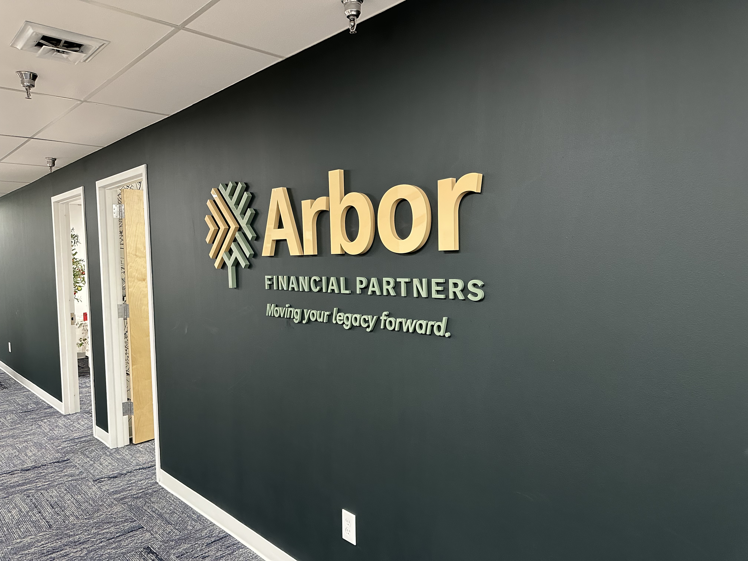
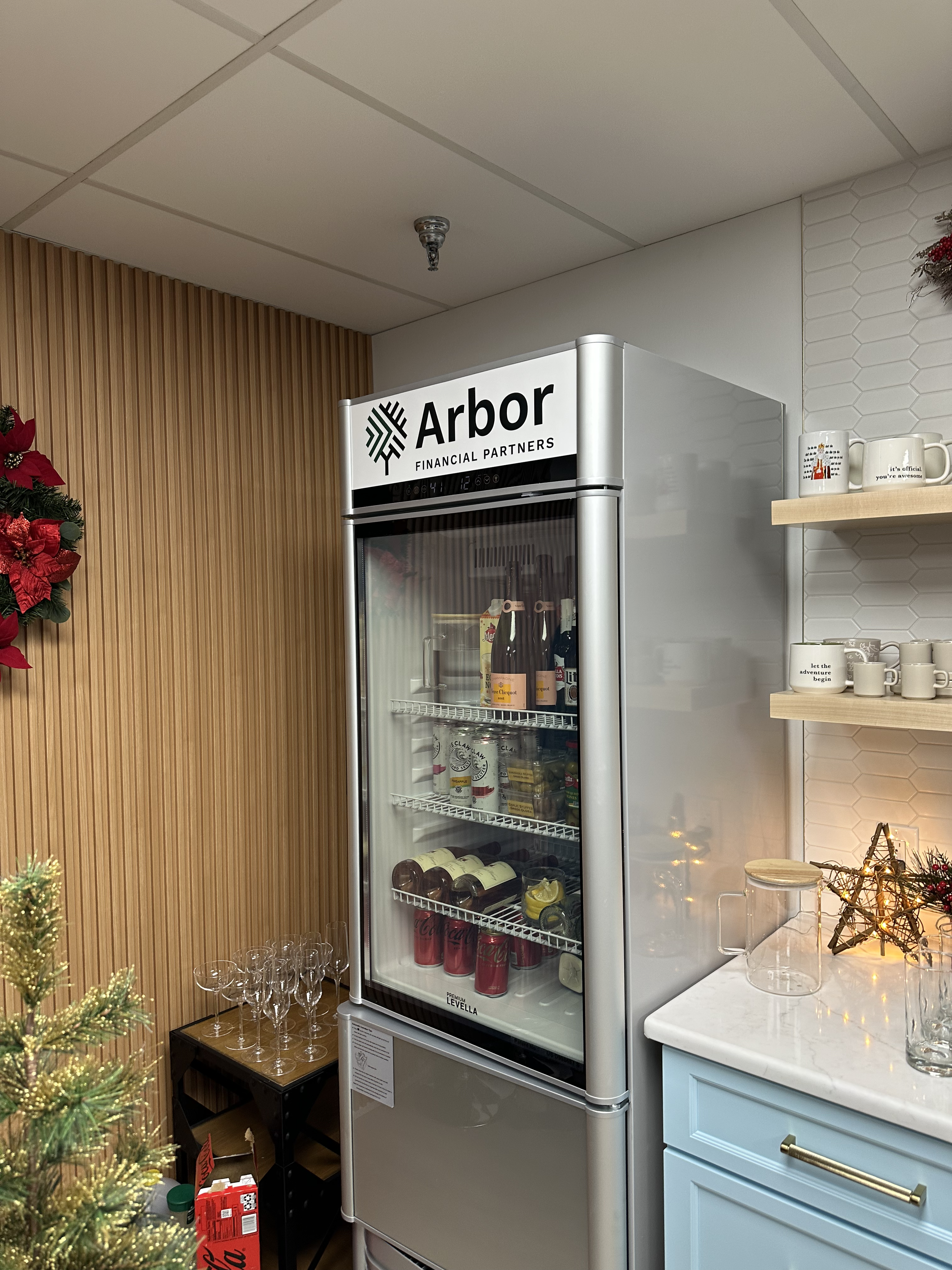
Arbor Financial

8
Srch
7
Prox Capital Group
7
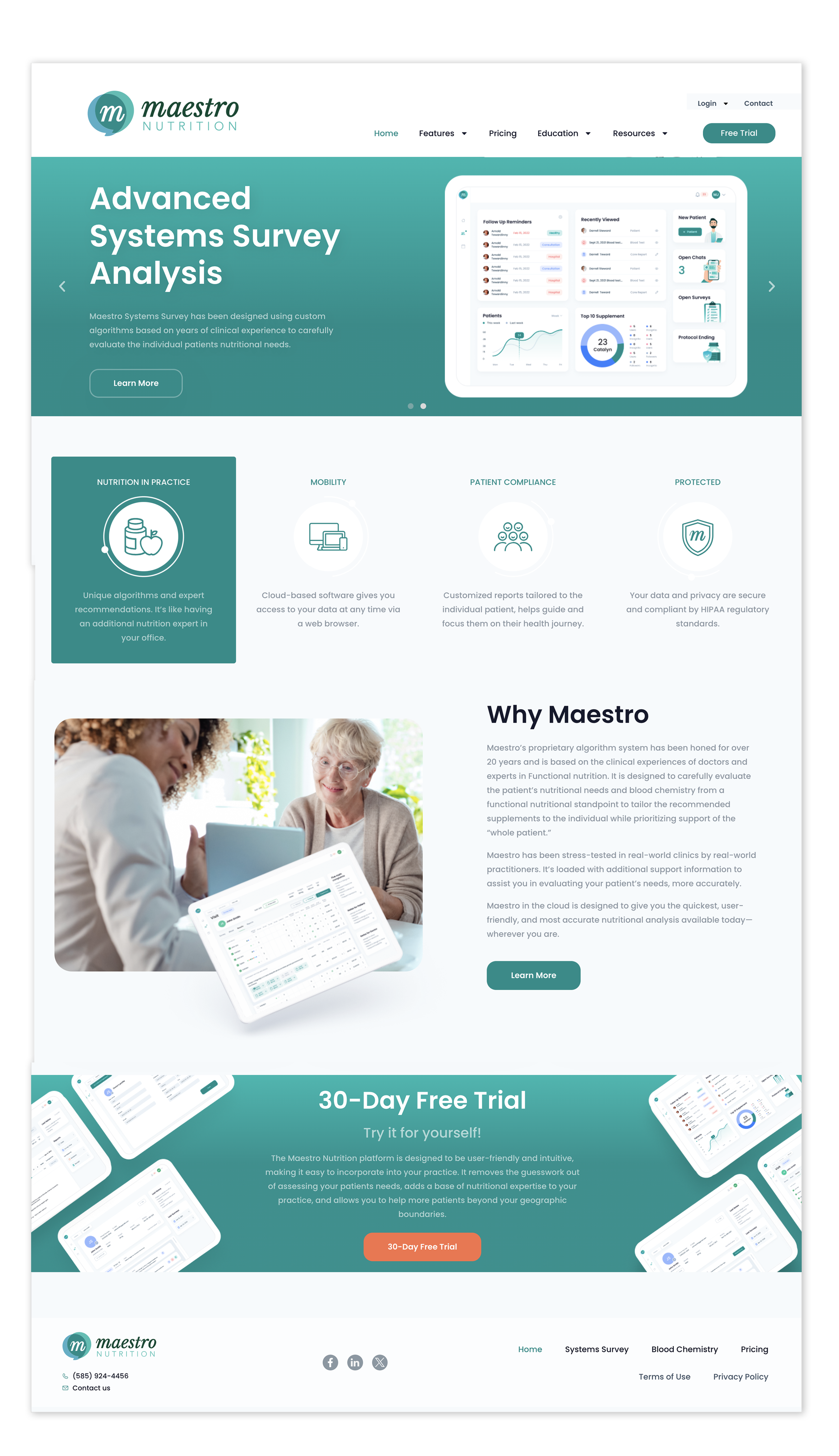
Maestro Nutrition
8
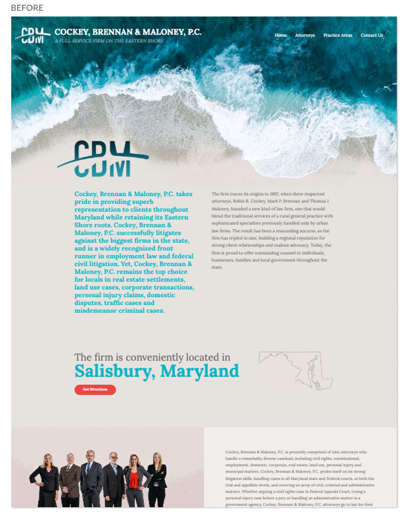
CBM Law
6
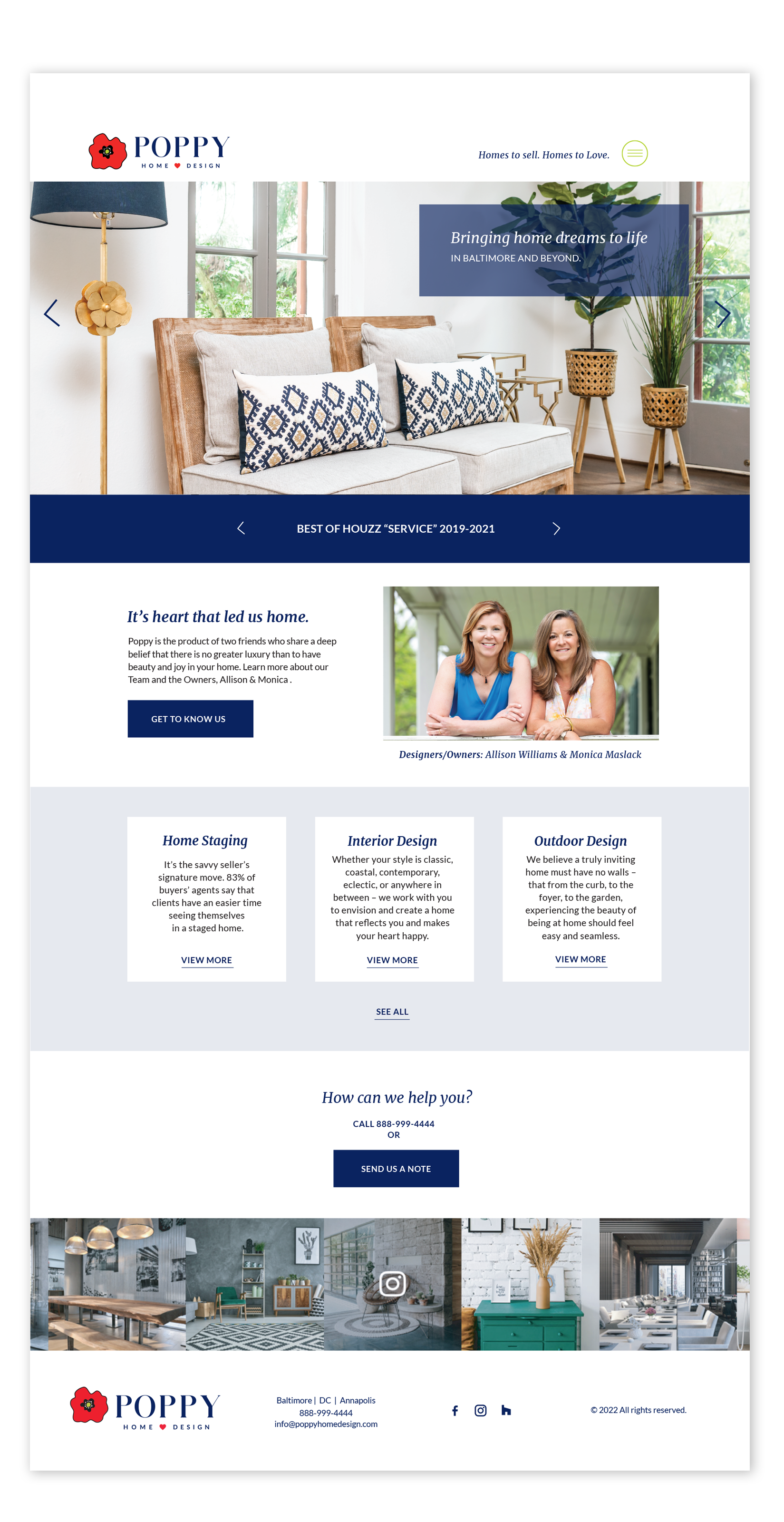
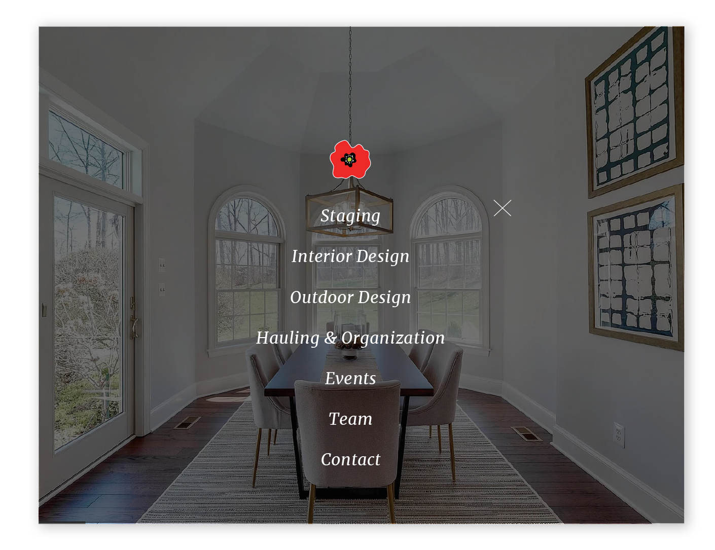
Poppy Home Design
5
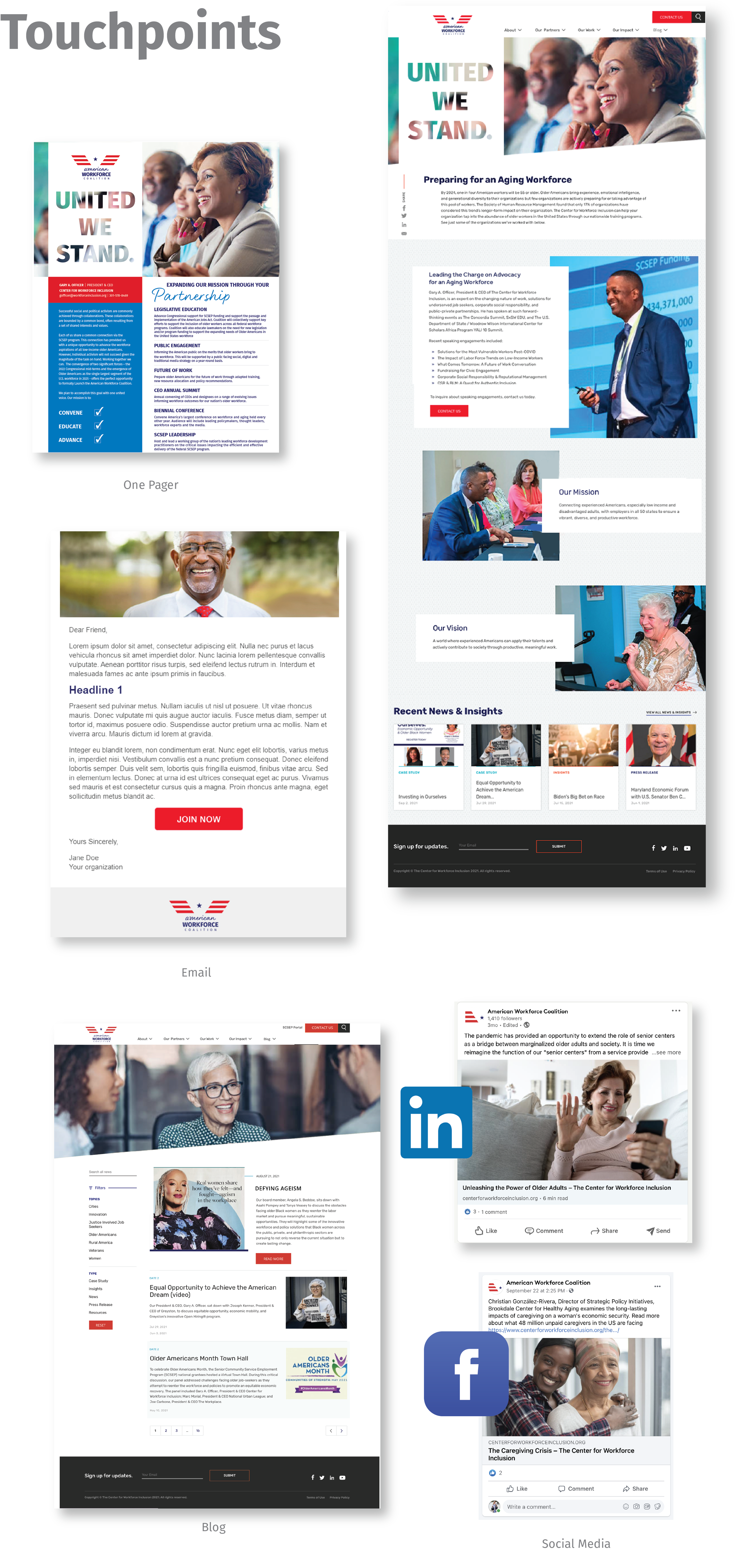
American Workforce Coalition

7
The Hampton Social Club

4
Maryland Chiro Clinics
4
EZ Shield
3
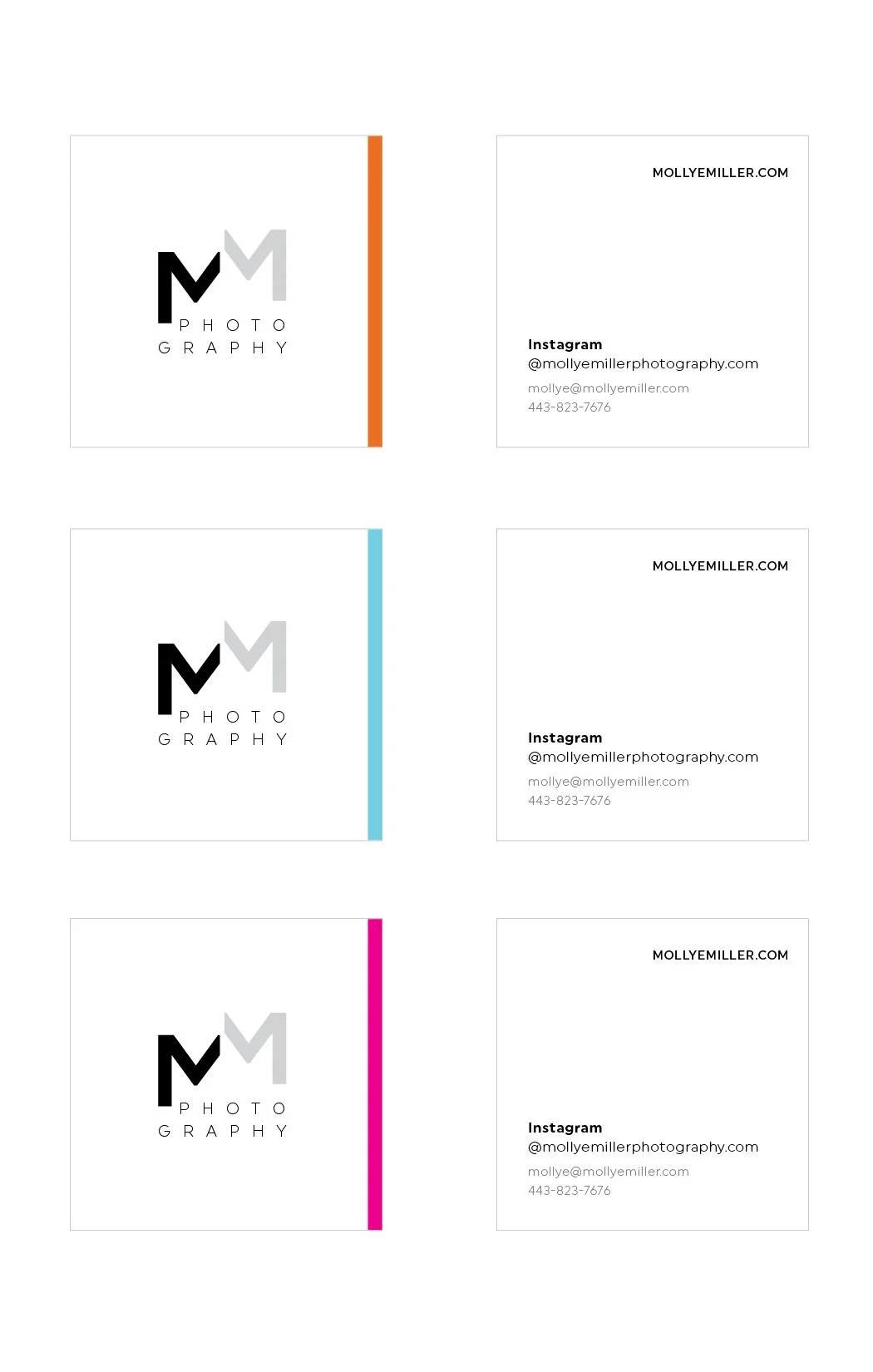
Mollye Miller Photography
6
Center for Workforce Inclusion

7
Oak Tree Direct Care
5
WellWoman

0
Discovery Channel/TLC

0
McCormick

0
T. Rowe Price

0
Under Armour

0
YMCA

0
Liberty Mutual

0
AutoZone

0
Gourmet Garden